
Plotting in Python#
In this section we will get familiar with Matplotlib - a popular Python library for creating visualizations in Python. It works seamlessly with NumPy, making it a powerful tool for data analysis and visualization. In this section, we’ll briefly introduce Matplotlib and show you how to create basic plots using NumPy arrays.
Installation and setup#
If you haven’t already installed Matplotlib, you can do so using conda:
conda install matplotlib
To use Matplotlib, you need to import it. The most common convention is to import it as plt:
import matplotlib.pyplot as plt
Creating a Simple Plot#
Let’s start by creating a simple plot of a mathematical function. Suppose we
want to plot the sine function between 0 and 2π. We can generate the x-values
using NumPy and then compute the corresponding y-values using NumPy’s sin
function:
import numpy as np
import matplotlib.pyplot as plt

# Generate x values from 0 to 2π
x = np.linspace(0, 2 * np.pi, 100)

# Compute corresponding y values using the sine function
y = np.sin(x)

# Create a plot
plt.plot(x, y)

# Add labels and a title
plt.xlabel('x')
plt.ylabel('sin(x)')
plt.title('Sine Function')

# Display the plot
plt.show()
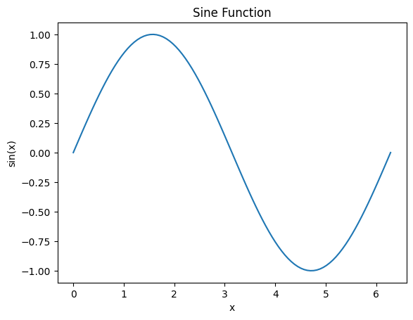
In this example, we used np.linspace to create an array of evenly spaced
values between 0 and 2π. We then computed the sine of each value in x to get the
corresponding y values. Finally, we used plt.plot to create the plot, added
labels and a title, and displayed it using plt.show().
Customizing Plots#
Matplotlib provides extensive customization options for your plots. You can change line styles, colors, markers, and more. Here’s an example of customizing a plot:
# Generate x values
x = np.linspace(0, 2 * np.pi, 50)

# Compute y values
y1 = np.sin(x)
y2 = np.cos(x)

# Create a plot with customizations
plt.plot(x, y1, label='sin(x)', linestyle='--', color='blue', marker='o')
plt.plot(x, y2, label='cos(x)', linestyle='-', color='red', marker='x')

# Add labels, title, and legend
plt.xlabel('x')
plt.ylabel('y')
plt.title('Sine and Cosine Functions')
plt.legend()

# Display the plot
plt.show()
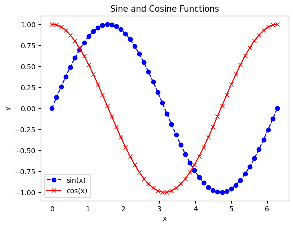
In this example, we used different line styles, colors, and markers for the two
functions and added a legend to distinguish them. Let’s take a closer look at
the arguments provided to plt.plot method:
label: This argument specifies the label for each line in the plot. It’s used for creating the legend later. In this example, “sin(x)” is the label for the first line, and “cos(x)” is the label for the second line.linestyle: This argument determines the style of the line connecting the data points. ‘–’ specifies a dashed line for the first plot, while ‘-’ specifies a solid line for the second plot.color: This argument sets the color of the line. ‘blue’ is used for the first plot, and ‘red’ is used for the second plot.marker: This argument determines the style of markers placed at each data point. ‘o’ specifies circular markers for the first plot, and ‘x’ specifies x-shaped markers for the second plot.
Scatter Plot#
A scatter plot is useful for visualizing the relationship between two sets of data points. Let’s create a scatter plot to visualize random data points:
# Generate random data points
x = np.random.rand(50)  # 50 random x-values
y = np.random.rand(50)  # 50 random y-values

# Create a scatter plot
plt.scatter(x, y, label='Random Data', color='green', marker='o')

# Add labels and a title
plt.xlabel('X-axis')
plt.ylabel('Y-axis')
plt.title('Scatter Plot Example')

# Display the plot
plt.legend()
plt.show()
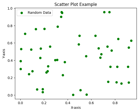
In this example, we generate random x and y values and create a scatter plot with green circles as markers.
Bar Plot#
A bar plot is often used to represent categorical data. Let’s create a simple bar plot to visualize the number of items in different categories:
# Categories and their counts
categories = ['Category A', 'Category B', 'Category C', 'Category D']
counts = [15, 28, 20, 35]

# Create a bar plot
plt.bar(categories, counts, color='purple')

# Add labels and a title
plt.xlabel('Categories')
plt.ylabel('Counts')
plt.title('Bar Plot Example')

# Display the plot
plt.xticks(rotation=45)  # Rotate x-axis labels for better readability
plt.show()
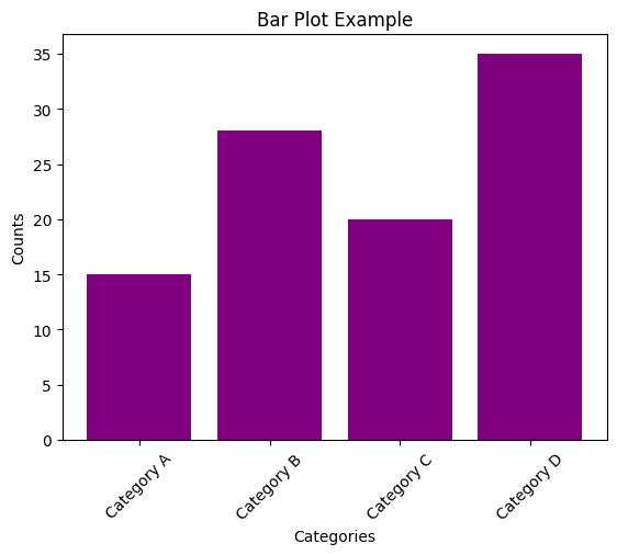
In this example, we use plt.bar to create a bar plot of category counts.
Plot with Error Bars#
Error bars are often added to plots to visualize the uncertainty in data points. Let’s create a plot with error bars to represent data with uncertainties:
# Data points and their uncertainties
x = np.array([1, 2, 3, 4, 5])
y = np.array([10, 15, 7, 12, 9])
y_err = np.array([1, 2, 1.5, 1.2, 1.8])  # Uncertainties in y-values

# Create a plot with error bars
plt.errorbar(x, y, yerr=y_err, fmt='o', color='blue', capsize=5.0,
             label='Data with Errors')

# Add labels and a title
plt.xlabel('X-axis')
plt.ylabel('Y-axis')
plt.title('Plot with Error Bars Example')

# Display the plot
plt.legend()
plt.show()
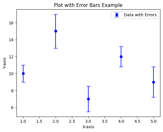
In this example, we use plt.errorbar to create a plot with error bars. The
fmt='o' argument specifies that we want to plot data points as circles.
2D and 3D plots for bivariate functions#
Matplotlib is also quite good at plotting bivariate functions in 2D plots.
Let’s start with a simple matrix (2D array), which can be plotted point-by-point
with functions like plt.imshow or plt.pcolormesh. It is also possible to
generate a contour plot of the underlying function with plt.contour or plt.contourf.
Let’s see an example of each of these functions:
# Create a 2D array
z = [[1,2],
     [3,4]]

# Plot with imshow
plt.imshow(z)
plt.title('imshow')
plt.show()

# Plot with pcolormesh
plt.pcolormesh(z)
plt.title('pcolormesh')
plt.show()

# Plot with contourf
plt.contourf(z)
plt.title('contourf')
plt.colorbar()
plt.show()
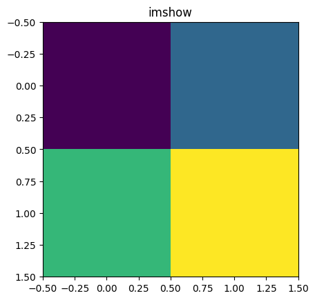
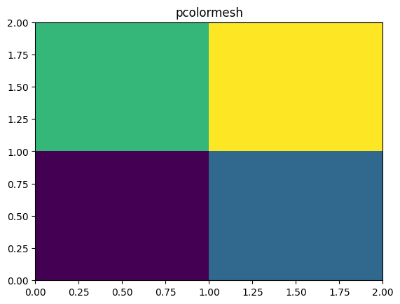
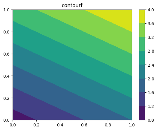
The first to plots print the values of the matrix (in different arrangements),
while the last one provides some kind of interpolation to create a
contour plot filling the space between contour lines (an empty contour plot
can also be generated with plt.contour).
As we anticipated, they also differ on the way data are arranged, with
plt.imshow displaying the matrix elements in the same position they have
in the matrix, while plt.pcolormesh and
plt.contourf assumes that the matrix represents values over coordinates
with the origin in the lower left corner
(i.e., better suited to represent functions of two variables).
We can also notice some differences in the default color aspect ratio (only
plt.imshow keeps the equal ratio), but this is a behaviour that can
be tuned for all the functions.
We were actually interested in plotting bivariate functions, for which we
would identify the matrix elements with the grid points over the 2D coordinate
space where the function is evaluated. Let’s take a 3 by 3 grid, which
is represented below (setting the origin in the lower left corner, as plt.pcolormesh
would do):
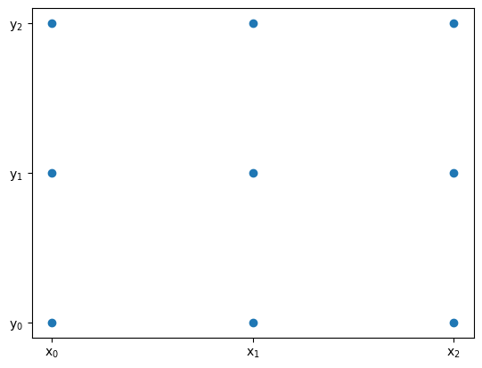
Each point is characterized by different \(x\) and \(y\) coordinates at which the function is evaluated. The function over the grid corresponds to the matrix
which can be generated using broadcasting on the following matrices:
Such matrices can be generated from \((x_0,x_1,x_2)\) and \((y_0,y_1,y_2)\)
vectors with np.meshgrid.
In the following code, we use this method to generate the grid where
the function \(f(x,y)=(\sin^2(x)+y^2)/(x^2+y^2)\) is evaluated and
then plotted using plt.pcolormesh:
# Create a 2D array
x = np.arange(-5, 5, 0.1)
y = np.arange(-6, 4, 0.1)
xx, yy = np.meshgrid(x, y)
z = np.sin(xx**2 + yy**2) / (xx**2 + yy**2)

# Plot with pcolormesh
plt.pcolormesh(x,y,z)
plt.show()
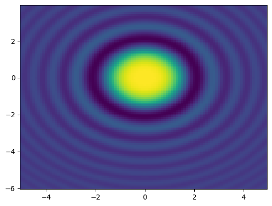
In the previous example, we have also explicitly specified the \(x\) and \(y\) axes, which
can be given as 1D arrays (x and y, as in this case) or as 2D arrays (xx
and yy). In the latter case, the arrays must have the same shape as z, and
the values in the arrays are used to label the axes.
It is also possible to plot bivariate functions in 3D using plot_surface
function, which can be called as a method of an Axes3D object. Note that
in this section, we have preferred to use the functional interface of Matplotlib,
but it is also possible to use the object-oriented interface, which is more
flexible and allows creating more complex plots
(see more on this here).
We are not going to go
further on this topic, but simply show an example of a 3D plot for the records:
# Create a 2D array
x = np.arange(-5, 5, 0.1)
y = np.arange(-6, 4, 0.1)
xx, yy = np.meshgrid(x, y)
z = np.sin(xx**2 + yy**2) / (xx**2 + yy**2)

# Plot with plot_surface
fig, ax = plt.subplots(subplot_kw={"projection": "3d"})
ax.plot_surface(xx, yy, z, cmap=plt.colormaps['viridis'])
plt.title('plot_surface')
plt.show()
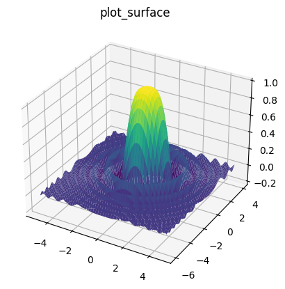
Compared to the powerful 2D features, Matplotlib’s 3D plotting capabilities are somewhat limited. Actually, for 3D plotting, it is often better to use other libraries, such as Mayavi.
Saving Plots#
In the codes shown throughout this section, we have used plt.show() to display
the plots over the backend.
You can instead save your plots to various image formats, such as PNG or PDF. For example,
to save the last plot as a PNG file:
plt.savefig('plot.png')
Conclusion#
Matplotlib is a powerful library for creating a wide range of plots and visualizations. This section provides a brief introduction, but there is much more to learn about Matplotlib’s capabilities and customization options.
For further information and detailed documentation on Matplotlib, visit the official website: https://matplotlib.org/stable/index.html